Options for a parallax slider
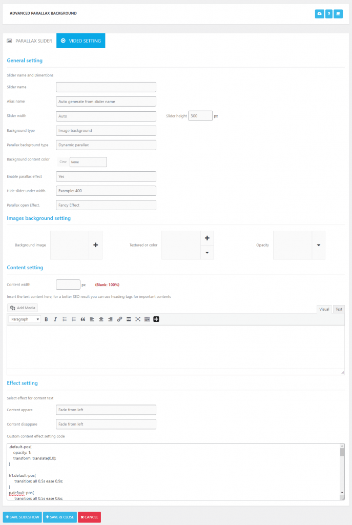
| Field name | Description | Default value |
|---|---|---|
| Slider Name | Title of slider | Empty |
| Alias name | Alias of slider (If you do not enter any text, default alias name is title of slider) | Empty |
| Slider width | Width size of slider. – Auto: default size. – Fixed width: users set the width – Full width: size of device screen | auto |
| Slider Height | Height size of slider. | 300 |
| Background type | Background types: – Image: Background is image – Video: Background is Video | image |
| Parallax background type | Parallax types: Dynamic parallax: Users can open to see content of parallax. Static: Parallax has no content. | Dynamic parallax |
| Background content color | Set color for parallax full view content | None |
| Enable parallax effect | Turn on/off parallax effect of slider | Yes |
| Hide slider under width. | Setting to hide slider when windows with less than this setting value | Empty (not hide) |
| Background image | Select background image for sliders (for background type is image) | Not set |
| Parallax open Effect | Effect apply for open full view | Fancy Effect |
| Background image | Select background image for sliders (for background type is image) | Not Set |
| Textured or color | (Cover color of background) | Not Set |
| Opacity | Fidelity of cover color on background | 50% |
| Background video | Select video background for sliders (for background type is video) | Not Set |
| Mute video | Turn on/off sound of video | Yes |
| Content width | Size of background content | Empty |
| Text content | Content is displayed on parallax block | Empty |
| Content appare | Effect is run when content is displayed | Fade from left |
| Content disappare | Effect is run when content is hided | Fade from left |
| Custom code | CSS is used for effect of content (Users can customize this CSS) | Default CSS for “Content appare” and “Content disappare” |